
CREATING BOLD NARRATIVES

Branding, Packaging, Visual Direction & Advertising
Personal project
CoreX
Motion
Concept, art direction, visual design, advertising layouts
ROLE

TOOLS
Affinity, AI-assisted mockups

CONTEXT
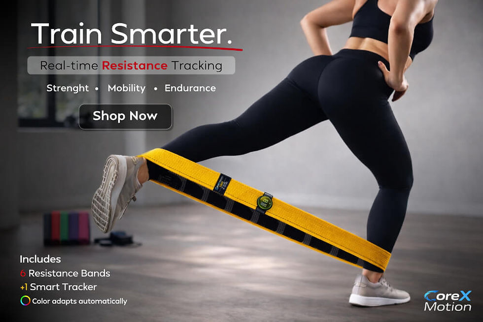
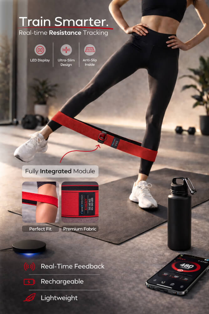
CoreX Motion is a modular fitness system: six interchangeable resistance bands paired with a removable smart tracker that records movement in real time. The tracker detaches for washing, keeping the electronics protected. The project covers the full visual system, from product identity and packaging to advertising assets for e-commerce and paid social.

PROCESS
The visual direction builds a consistent tech-product aesthetic: dark backgrounds, directional lighting, and blue LED accents position the tracker as the technological core. Band colors map directly to resistance levels, making the system readable at a glance. Each advertising format was designed from scratch: layout, copy hierarchy, and composition built for mobile-first environments and e-commerce performance. AI was used as an exploration tool for lighting and product visualization, with all graphic design, asset composition, and advertising layouts executed in Affinity.

COLOUR PALETTE
Two registers: dark backgrounds and blue LED accents for the technology layer, band colors as a functional coding system. Each color signals a resistance level. Red and yellow carry the advertising visuals as the highest-contrast, highest-energy pair in the range.

DESIGN DECISIONS
VISUAL SYSTEM
Dark environments, directional lighting, single blue LED accent. The tracker stays the visual focal point across every format, distancing CoreX Motion from generic fitness accessory aesthetics.

LOGO DESIGN
Mansfield Bold and ExtraBold across all performance copy. Geometric, rounded terminals, no decorative elements. Weight does the work without competing with the product visuals.

TYPOGRAPHY
Designed from scratch: a custom "C" with a speed-cut in blue gradient, paired with a blue "X". The symbol also works in six color variants, one per resistance band level, tying the logo directly into the product system.
RESULTS

A coherent visual system across product, packaging, and advertising: same aesthetic language, same hierarchy, every format designed to work independently and as a whole.


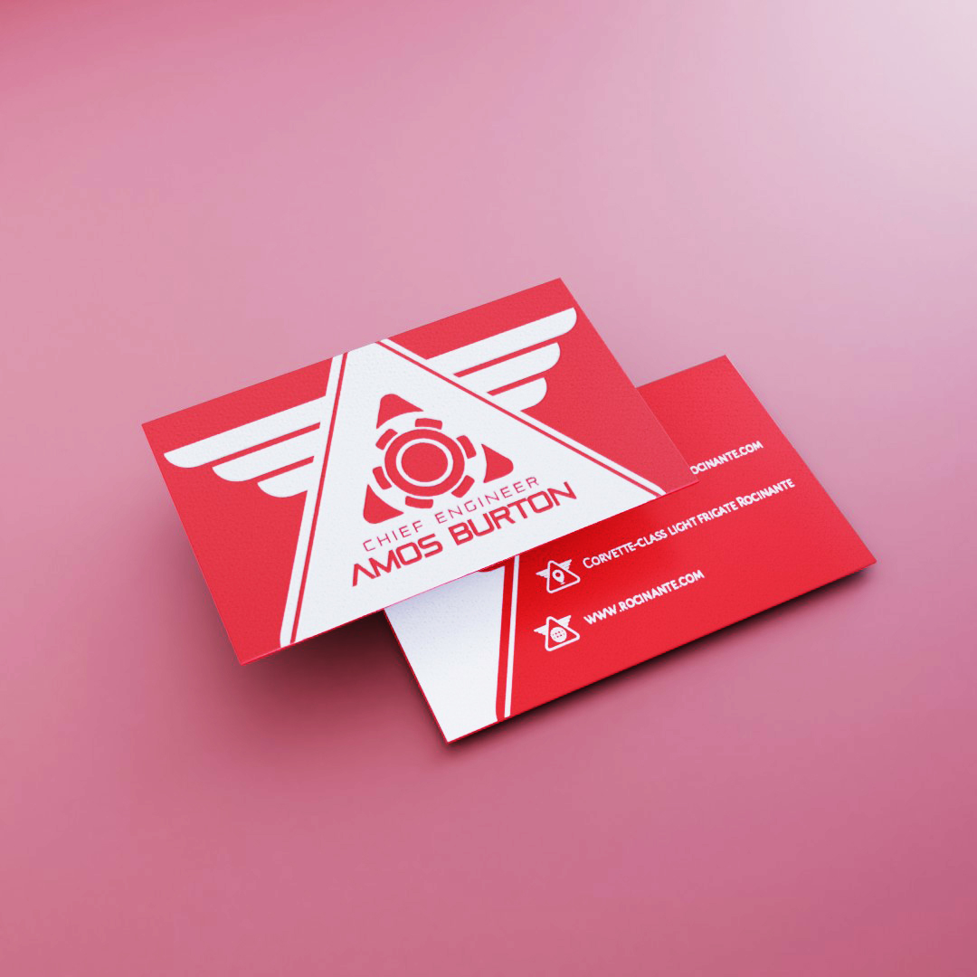
Cards - The Expanse
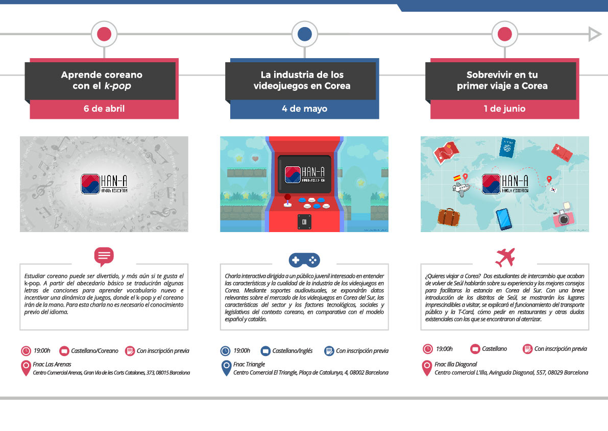
Flyer - Han-A

Book - Prado
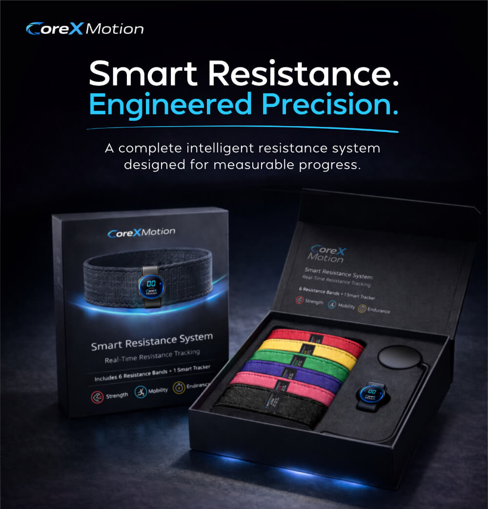
Ads - CoreX Motion
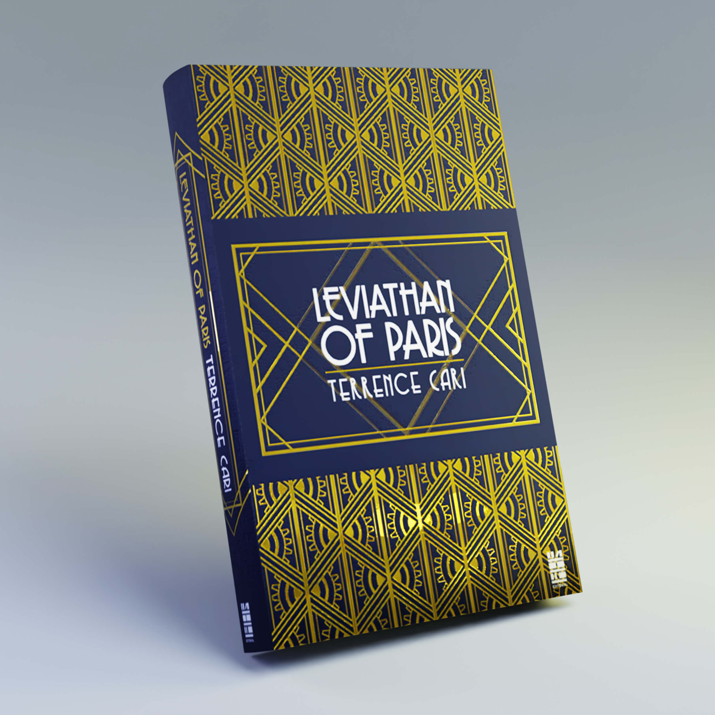
Book - Decopunk

Packaging - Magic Store