
CREATING BOLD NARRATIVES

Packaging, Label Design
Speculative project
Dark Soaps Label Design
Art Direction, Graphic Design, Illustration, 3D Mockup
ROLE

TOOLS
Illustrator, Photoshop, Blender, AI-assisted mockups

CONTEXT
Dark Soaps is a speculative liquid hand soap line with three variants: coconut milk, honey & lavender, and cocoa & vanilla. Each has its own illustration and colour-coded bottle. The brief was a full label system, front and back, gothic in feel and legible in practice.


PROCESS
Sketches explored two directions: character illustration and purely typographic labels. The oval format with dense ornamental borders was chosen. The front logotype is a blackletter base redrawn by hand and distorted to fit the label shape. Each variant gets its own central botanical illustration. The back label uses Victorian Parlor Vintage Alternate, keeping the ornamental language consistent at a smaller scale. Bottles were rendered in Blender with a distinct colour per variant.


COLOUR PALETTE
Black is the base across all labels. Each bottle is colour-coded: terracotta, lavender, and warm beige, one per variant. The label stays dark regardless of the bottle, so the colour codes the product without softening the gothic character.

DESIGN DECISIONS

VISUAL SYSTEM
One label structure, three variants. The ornamental frame, logotype placement, and typographic hierarchy stay identical across all three. What changes is the central illustration and the bottle color.

LABEL CONSTRUCTION
The logotype is a custom blackletter, redrawn over a base font and distorted to fit the label shape. The back label uses Victorian Parlor Vintage Alternate, a free serif with strong Victorian apothecary character that holds well at small sizes.

TYPOGRAPHY
The front label combines hand-modified lettering with detailed botanical illustration and a dense gothic ornament system. Every element was drawn or adapted manually, nothing is off-the-shelf.
RESULTS

Dense gothic ornament applied with structural discipline: same frame, same hierarchy, same weight across all three. The system works because every decision about spacing, lettering, and illustration came from the same logic.


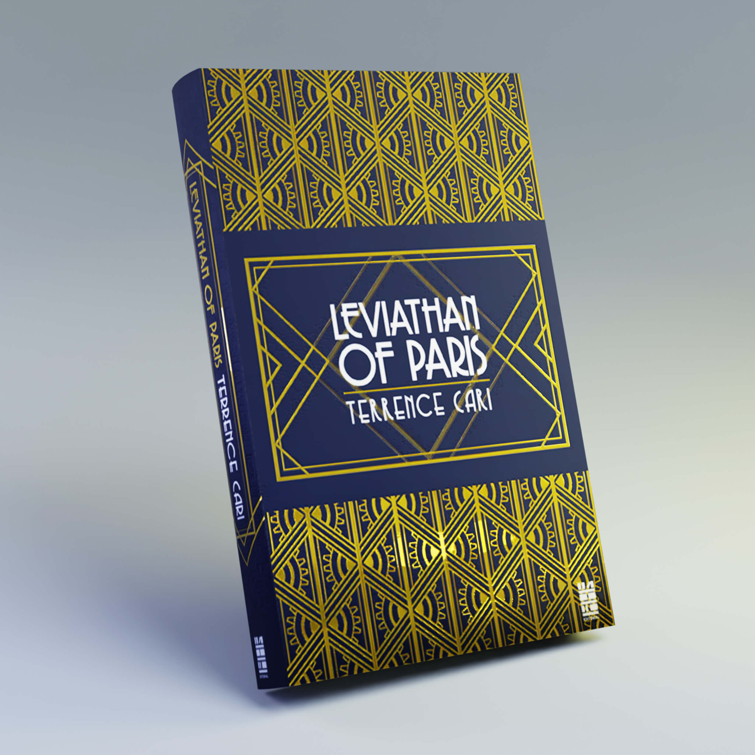
Book - Decopunk

Packaging - UFO Pizza
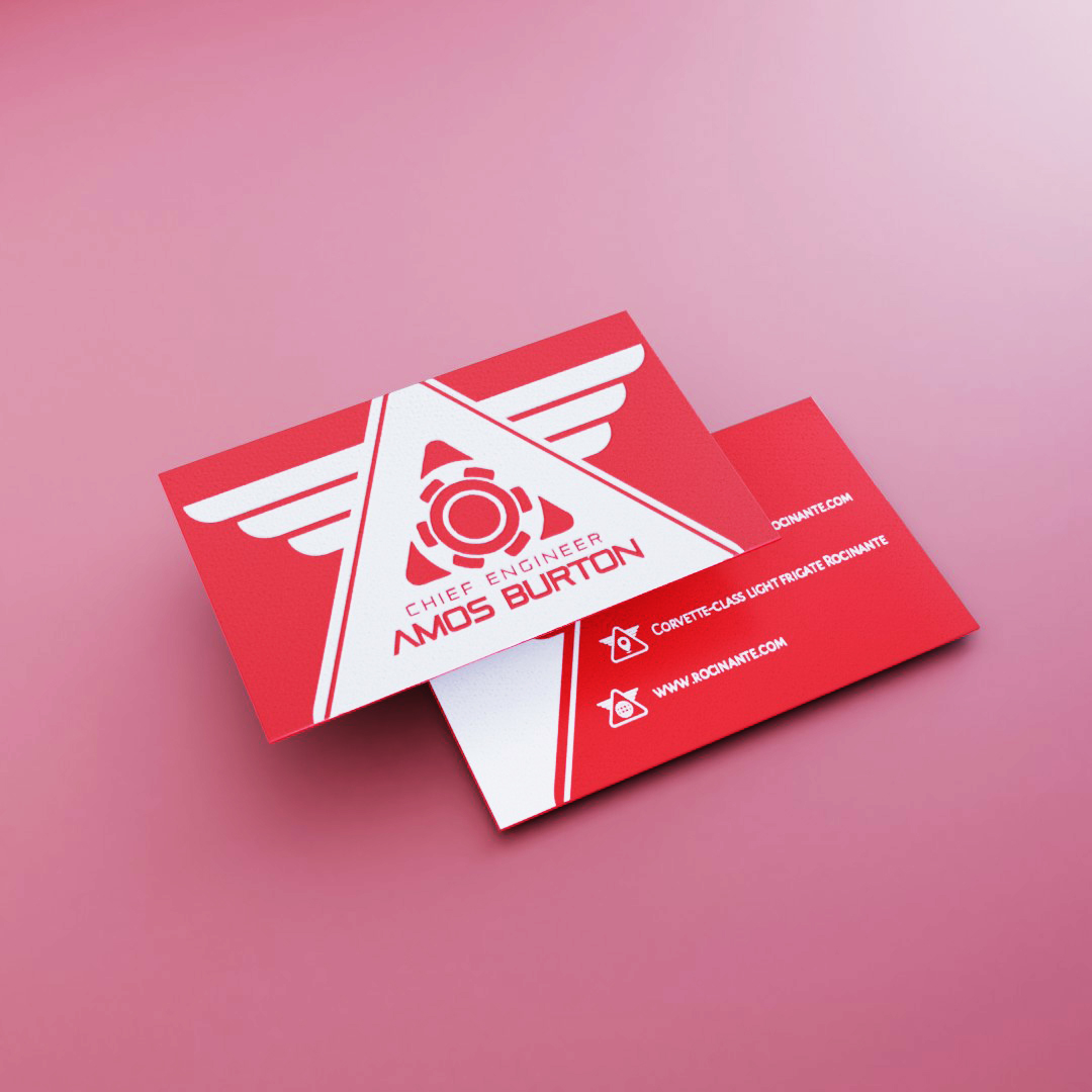
Cards - The Expanse
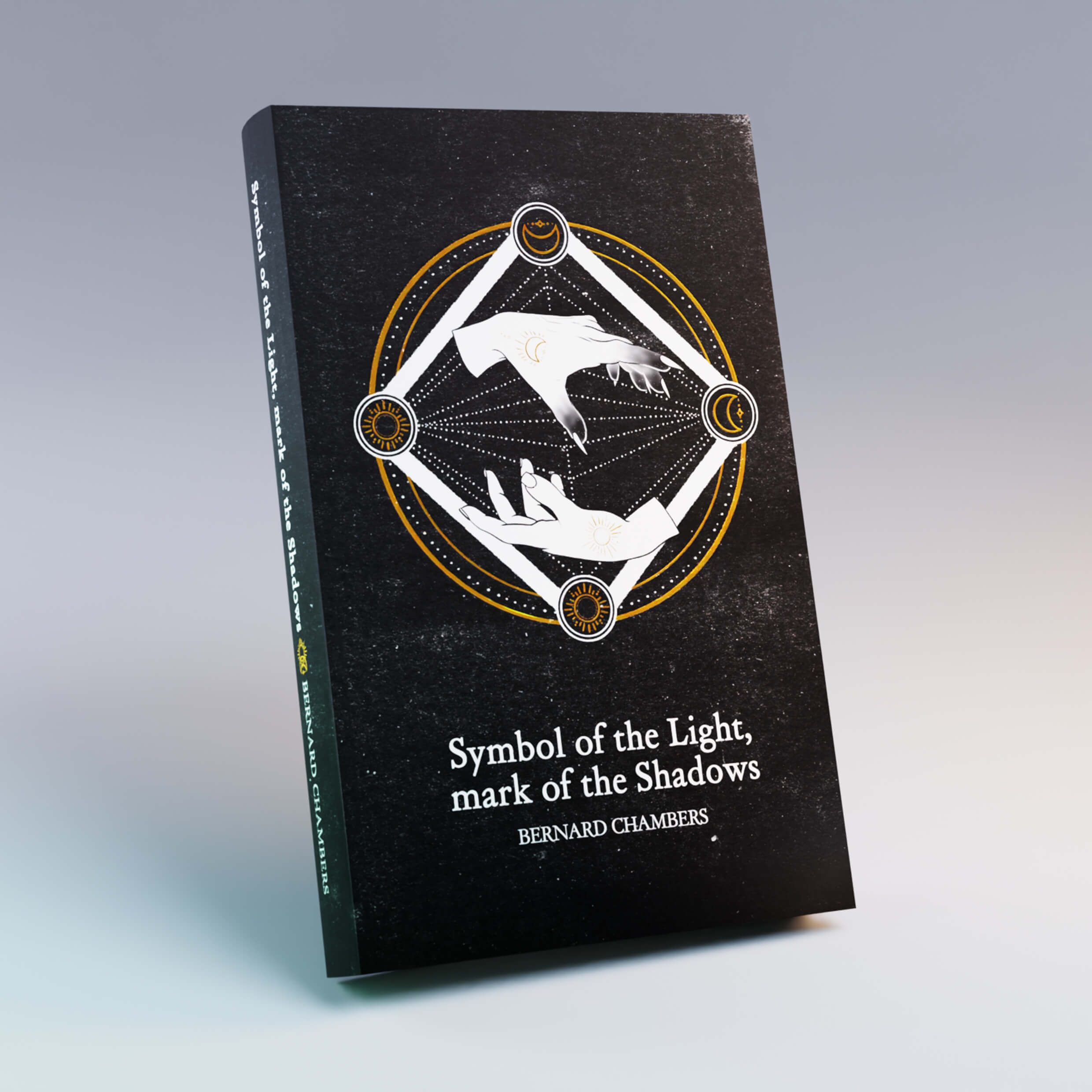
Book - Minimal

Book - Montverd

Label - Gothic Soap