CREATING BOLD NARRATIVES
1. Brief Project Description
A Corporate Identity Manual developed to unify and standardize the visual branding of Han-A, an association operating across Spain through autonomous communities. The manual ensures consistent application of branding elements while allowing regional adaptations when necessary.


2. Initial Problem
Han-A needed a cohesive branding system to address inconsistencies in visual identity across its autonomous communities. While operating independently, the communities required a unified brand to present a professional image nationally, especially for shared resources like the website or social media.
🔻 What not to do:
Too many fonts – Creates clutter and weakens brand identity.
Poor layout – Text and elements feel randomly placed.
Bad integration – Taegeuk and Korean text look pasted in.
Amateur shapes and effects – Low-quality graphics harm credibility.
Harsh colors – Red/blue are misused without visual balance.
No clear identity – Doesn’t reflect the brand’s purpose or values.
3. Process
Audit: Reviewed past logos to identify design flaws (e.g. inconsistent fonts, poor hierarchy).
Color Palette: Defined red, blue, black, and white based on Korean flag for cultural coherence.
Typography: Explored modern, readable typefaces fitting for formal and informal use.
Sketches: Developed multiple layouts (icon, horizontal, vertical) for flexibility.
Icon Design: Created a unified symbol merging tradition and modernity.
Feedback: Collected input from community leaders to refine the design.
Final System: Built a modular identity adaptable across formats and regions.


4. Solution
The final manual provided Han-A with a cohesive branding system that reinforced its identity as a unified association. By offering clear and actionable guidelines, the manual ensured consistency across autonomous communities, strengthening Han-A’s visual presence both locally and nationally.
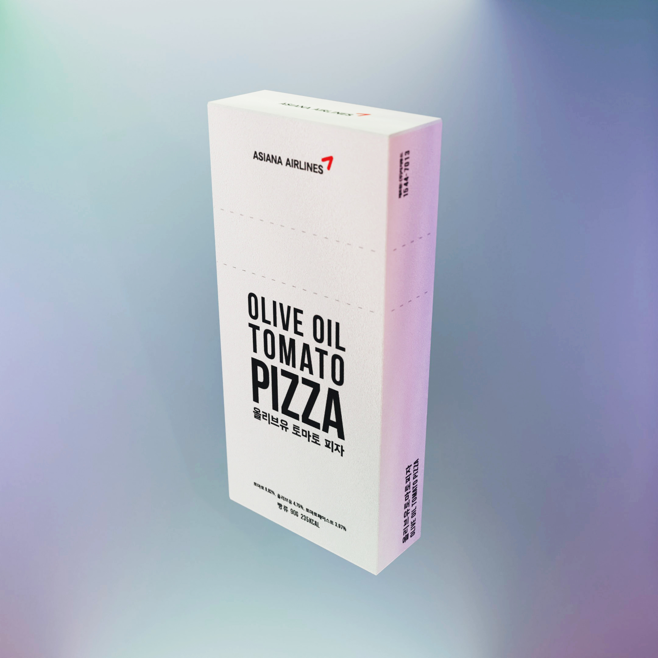
Packaging - Pizza Redesign

Packaging - Magic Store
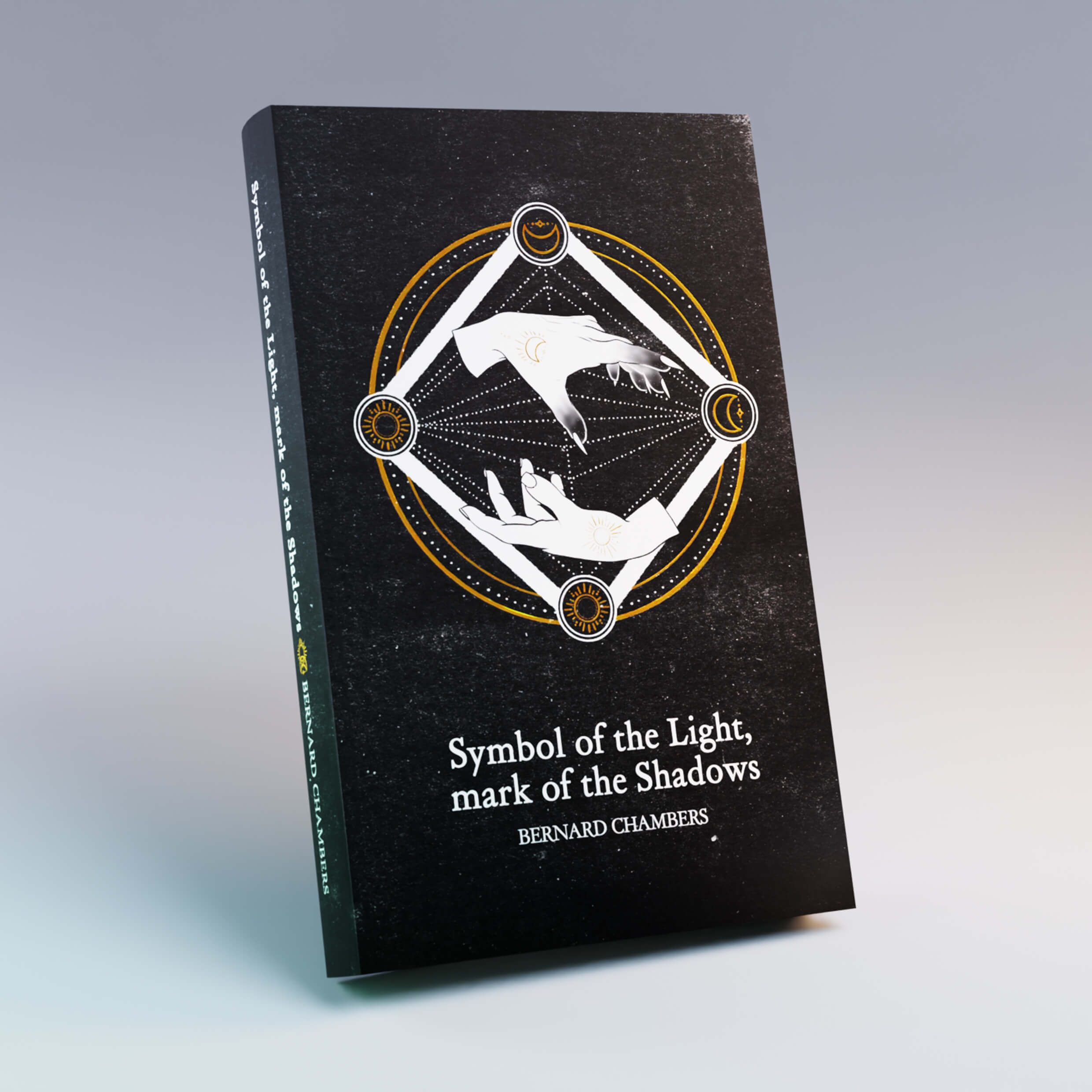
Book - Minimal
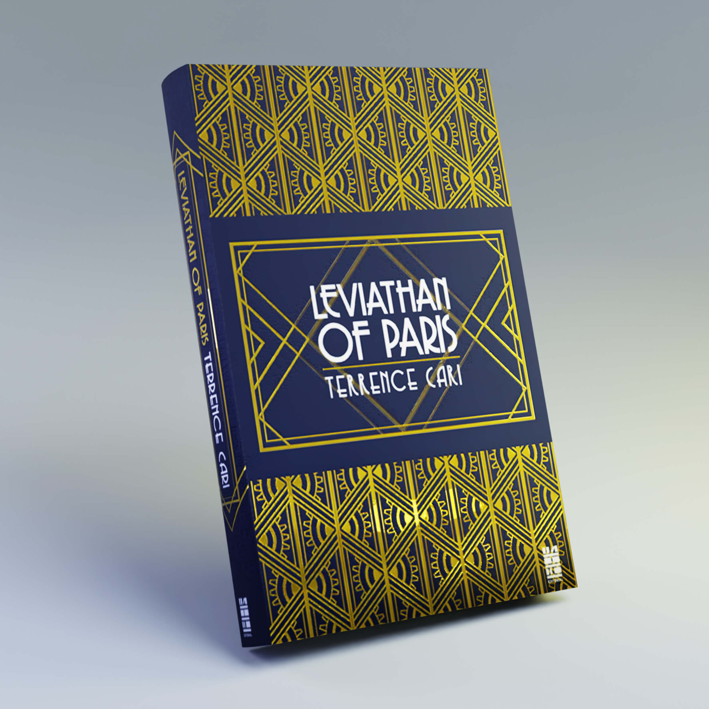
Book - Decopunk

Book - Prado

Packaging - Heparine