CREATING BOLD NARRATIVES
1. Brief Project Description
This project is a lettering and illustrated menu design for Inuyama, a Japanese restaurant. The menu merges graphic illustration with custom typography to create a fun, vintage-inspired yet modern visual identity. The goal was to design a menu that not only informs but enhances the dining experience, making it memorable, playful, and visually engaging.


2. Initial Problem
Many restaurant menus are either too plain, cluttered, or hard to navigate—especially in fast-paced or visually chaotic dining environments. They often rely on generic templates, uninspired type choices, or poor hierarchy, which can make the customer experience feel less engaging. This project aimed to solve that by creating a menu that is:
Clear in structure, with well-defined sections (entrees, mains, drinks, desserts, sushi).
Visually consistent, using a limited but bold color palette and themed illustrations.
Brand-strong, incorporating Japanese cultural references in a fun and accessible way.
🔻 What not to do:
Generic layouts — Confuse the reader, lacking clear visual flow.
Basic fonts — Undermine the brand’s identity.
Mismatched photos — Make the menu feel rushed or cheap.
Unbranded design — Fails to reflect the brand, looks unprofessional.
3. Process
The design process began with visual research into traditional Japanese graphics, retro poster styles, and playful layouts. Key steps included:
Sketching layout compositions for easy navigation.
Designing custom lettering and banners to guide the eye across the page.
Creating vector-style illustrations of food items, drinks, and characters to add warmth and personality.
Developing a cohesive color palette (red, black, off-white) that stands out and feels culturally relevant.
Testing readability and adjusting font sizes, spacing, and positioning for user clarity.


4. Solution
The final design is a vibrant, well-structured illustrated menu that feels authentic, modern, and fun. Here's how it solves the original issues:
Clear hierarchy: Each section is boxed and labeled with bold headers and directional graphics that help guide the customer.
Visual engagement: The use of illustrations (e.g., takoyaki, sake, sushi, desserts) makes the food look appealing and gives personality to the menu.
Brand identity: The typography and illustration style give the restaurant a unique visual language that stands out from competitors.
Interactivity and accessibility: Includes a QR code for ordering via an app, integrating physical and digital interaction smoothly.
This design doesn’t just list food — it tells a story and immerses the customer in a playful Japanese dining atmosphere.
Tutorials:
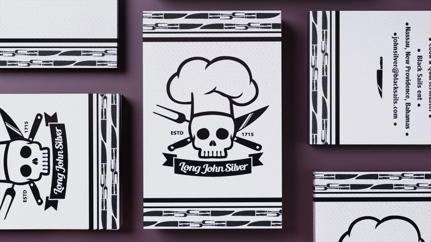
Cards - Black Sails

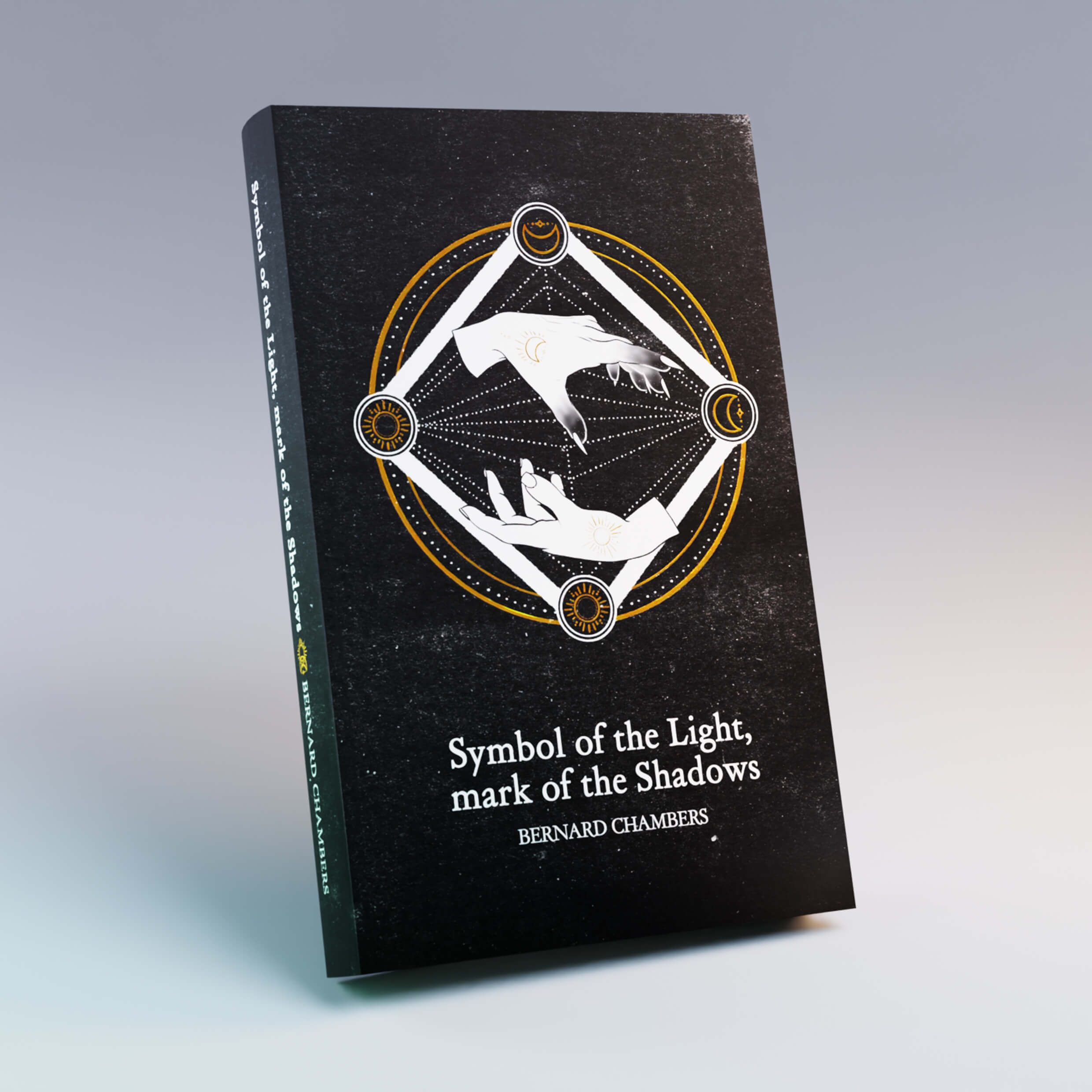
Book - Fahrenheit
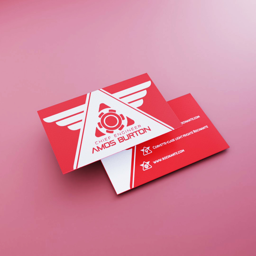
Cards - The Expanse

Packaging - UFO Pizza

Art Toy - Hentities
Book - Minimal