
CREATING BOLD NARRATIVES

Packaging, Redesign
Asiana Airlines
Pizza Box
Redesign
Art Direction, Graphic Design, Packaging Design
ROLE

TOOLS
Illustrator, Blender, Photoshop, AI-assisted mockups

CONTEXT
A redesign of Asiana Airlines' in-flight pizza box. The passenger doesn't choose the pizza, Asiana does, so the packaging doesn't need to sell. It just needs to inform.


PROCESS
Sketches explored how to structure the product name, Korean translation, and nutritional info using only type, no image, no decoration. Multiple scales were tested before settling on the stacked layout: ingredient names growing from small to large, PIZZA at maximum weight. The clinical look is a consequence of the approach, not a reference.

COLOUR PALETTE
White, black, and Asiana red. White is the base, black handles all typography and structure, and red appears only for the airline logo. Three colours: one for each layer of information.

DESIGN DECISIONS

ANTI-BRANDING
No food photography, no promotional language, no decorative elements. In an airline context where the passenger has no choice, the packaging doesn't need to persuade. Removing the sell reveals the product more clearly than any illustration would.

BEFORE / AFTER
Bebas Neue for the Latin text: condensed, bold, maximum presence at minimum space. BM Hanna 11yrs Old for the Korean: a rounded, slightly informal serif that softens the austerity without breaking it.

TYPOGRAPHY
The original: dark background, food photo, yellow italic type, competing weights. The redesign: white, no image, one typeface, the product name as the only graphic element. Same product, opposite approach.
RESULTS

Packaging that communicates through restraint. In an airline tray, not trying to sell is itself a design decision.


Book - Fahrenheit

Packaging - Heparine
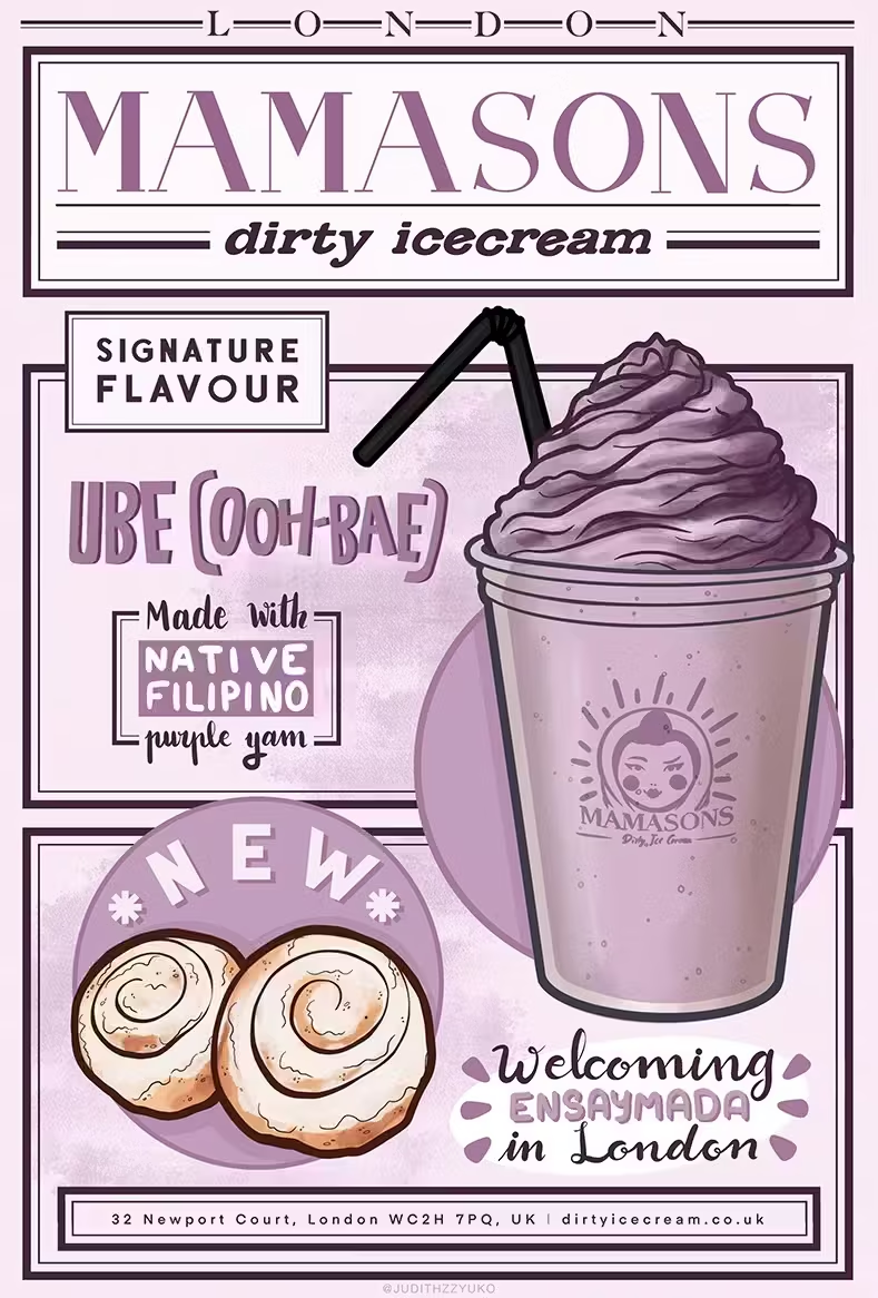
Poster - Mamasons

Book - Montverd

Packaging - UFO Pizza
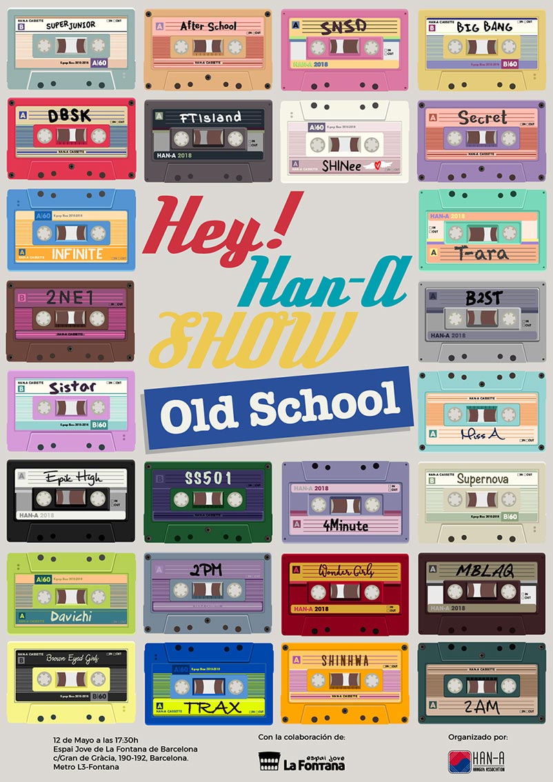
Poster - Han-A