
CREATING BOLD NARRATIVES
Branding, Packaging, Visual Direction & Advertising
Personal project
Velour Skin
Art direction, packaging design, brand design, ads
ROLE

TOOLS
Affinity, AI-assisted mockups

CONTEXT
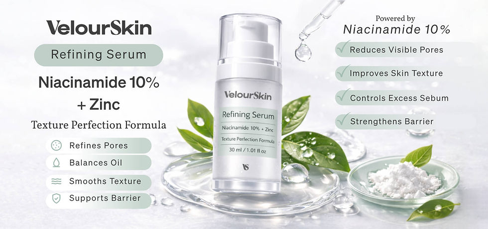
VelourSkin is a dermocosmetic skincare brand. Full visual system: brand identity, packaging design, and e-commerce and paid social advertising campaign built around Refining Serum as hero product and second SKU, Hydrating Barrier Cream, validating system scalability.


PROCESS
The system is built on a color-coding logic tied to product function, carried through from label to ad. Packaging uses clean hierarchy and generous white space. Advertising layouts were designed across multiple formats and ratios, with ingredient emphasis and strong mobile hierarchy. All design was executed in Affinity, with AI used for lighting and composition exploration.

COLOUR PALETTE
Organized by product function: mint green for pore-refining, soft blue for hydration. Each color runs from label to advertising assets, with the hero product of each campaign setting the dominant tone.

DESIGN DECISIONS

VISUAL SYSTEM
Soft clinical aesthetic: light backgrounds, water and ingredient imagery, no pharmaceutical coldness and no aspirational beauty excess. The same visual register holds across packaging and every ad format.

LOGO & IDENTITY
Vollkorn for display and headlines: a serif with warmth that softens the clinical register. Söhne for secondary copy and labels: neutral, precise, modern. The pairing sits between beauty and dermatology without leaning fully into either.

TYPOGRAPHY
Custom wordmark combining two typefaces, outlines converted to paths. The VS monogram was designed from scratch without AI assistance, and functions independently as a product mark on packaging and as a closing element in ads.
RESULTS

A full visual system designed to be consistent from label to feed, across formats, products, and campaign needs.



Cards - The Expanse

Book - Fahrenheit

Label - Gothic Soap

Social Media - Han-A

Ads - CoreX Motion

Book - Decopunk